Danmasta
Communicator
 Dance Commander
Posts: 98
|
Post by Danmasta on Aug 26, 2007 13:01:09 GMT -5
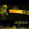
Hey everyone, i'm making a portfolio website that I can send to potential employers so they can see my works and stuff. What do you guys think of this design? should I use something brighter? with lots of colors?  Sorry about the watermark  There's a lot of guests that come on this website, I have to make sure no one can steal it.. |
|
|
|
Post by chero on Aug 26, 2007 13:05:39 GMT -5
I completely understand your concern, Danmasta. I love your layout, but I agree that it is dark. Maybe make the flowing strip on the lower left your favorite color and see how the light burst in background looks in yellow or orange.  Does it remind you of the Sun...? Does it remind you of the Sun...? |
|
Danmasta
Communicator
Dance Commander
Posts: 98
|
Post by Danmasta on Aug 26, 2007 15:23:18 GMT -5
Thanks for the feedback Chero  How's this one feelin?  |
|
|
|
Post by chero on Aug 26, 2007 16:46:36 GMT -5
Just what I had in mind, Danmasta!  My only suggestion left is to make the background area (where you have the text "About me - ..") a different color/shade to pop out the text. You know, to make it distinct from your sidebar (About Me, Creations, Contact, etc) and to grab your potential employers' attention. |
|
|
|
Post by brittany on Aug 26, 2007 19:03:03 GMT -5
The second version is a lot better! Keep up the good work! |
|
Danmasta
Communicator
Dance Commander
Posts: 98
|
Post by Danmasta on Aug 29, 2007 0:18:51 GMT -5
Thanks for the help guys!  Sorry I didn't respond sooner.. but I made a few changes, also I made a front page that will have a button which links to the actual website. Let me know what you think.. your suggestions helped me a lot the first time Here is the entrance page.. you will click on that little planet and it will take you to the home page of the content.  And this is the main content page.. I think im gonna make a couple different variations of this same layout for the other pages.. to leave more room for images on the Creations page, and more space for the resume and stuff like that.. I'll probably take away the buttons on the left and place smaller ones at the top or bottom of the page and expand the content box to create more space, but only on the pages where extra space would be a benefit.  What do you guys think? I think it's safe to say that this is Sunshine inspired |
|
|
|
Post by nimue on Aug 29, 2007 8:38:37 GMT -5
This looks awesome!
|
|
|
|
Post by brittany on Aug 29, 2007 9:02:31 GMT -5
|
|
|
|
Post by chero on Aug 29, 2007 12:50:56 GMT -5
Wow! I love what you did with the sidebar and the entrance page fits the theme perfectly. |
|
Danmasta
Communicator
Dance Commander
Posts: 98
|
Post by Danmasta on Aug 30, 2007 16:32:42 GMT -5
Thanks everyone! do the planets look realistic enough? is there enough depth? I made everything myself and i didn't use any references so i hope i got the lighting correct. if there is anything that seems out of place, let me know |
|
|
|
Post by nimue on Sept 4, 2007 6:27:15 GMT -5
So far so good.
|
|
Starshine
Pilot
 There will be nothing to show that we were ever here - but stardust.
Posts: 297
|
Post by Starshine on Sept 4, 2007 11:22:12 GMT -5
You did it completely yourself? Wow.
|
|
Danmasta
Communicator
Dance Commander
Posts: 98
|
Post by Danmasta on Sept 10, 2007 12:56:42 GMT -5
Thank you Nimue and TheHunter |
|
|
|
Post by nimue on Sept 13, 2007 4:25:15 GMT -5
No problem! You're really talented. |
|
|
|
Post by cococi on Sept 14, 2007 10:21:52 GMT -5
what do u use to create that and how much time does it take ? btw great job i'd say my adice straighten the contours and lines , maibe the image is to large and thats why they look like that ... keep up the good work
|
|


 There's a lot of guests that come on this website, I have to make sure no one can steal it..
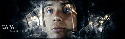


 Does it remind you of the Sun...?

 Sorry I didn't respond sooner.. but I made a few changes, also I made a front page that will have a button which links to the actual website. Let me know what you think.. your suggestions helped me a lot the first time